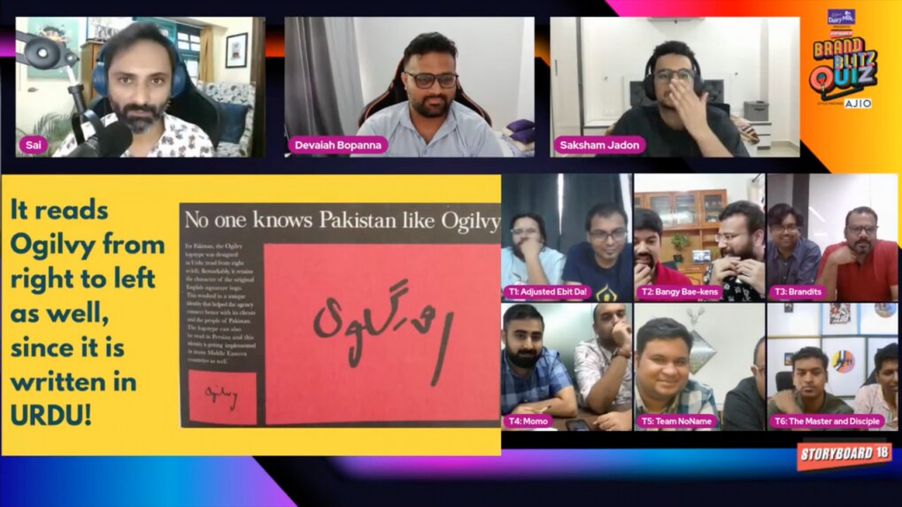
What is interesting about the Ogilvy palindrome logo?
Sai Ganesh, quiz master of Brand Blitz Quiz, quizzed leading brand geeks from the marketing community in the regional final (south zone) episode of the Brand Blitz Quiz. Here’s a story behind the Ogilvy logo for the Pakistani, Bangladeshi and Middle Eastern market.
ADVERTISEMENT
During the regional final of the south zone of Storyboard18’s Brand Blitz Quiz, quizmaster Sai Ganesh posed a very interesting question to the participants. It was regarding a logo of creative agency Ogilvy, done for our neighboring country Pakistan.
What is interesting about the original Ogilvy logo is that it’s the actual signature of founder David Ogilvy. The logo for the Pakistani, Bangladeshi and soon to be Middle Eastern market is an adaptation of it. It can be read from both sides. In English, from left to right it reads ‘Ogilvy’ as signed by David Ogilvy himself. However, when read from right to left, it reads the same in Urdu or Persian.
One of the guest panelists Devaiah Bopanna, who worked at Ogilvy in the early days of his career, mentioned that the only problem he ever had with the logo was that it was small and illegible from afar. And as it is one of the most important things in marketing, he suggested that the logo needs to be bigger.
Watch the full episode here.

