Decoding auto manufacturers’ logos and their meanings
Auto brands are adopting new and simpler logos. Here’s why.


ADVERTISEMENT
A vast majority of automobile manufacturers have hopped on to the trend of revamping their brand logos. It's a similar pattern that these companies have been following - simplifying their logos. A smoother, cleaner and minimalist design is what is being chosen for the foreseeable future. Back in the 90’s automotive manufacturers’ logos were made three dimensional in an attempt to showcase it in the same way it would appear on a vehicle. However, with the rapid growth of digital mediums and formats in the last decade, these brands have adopted minimalist two-dimensional logos as they translate better onto screens.
Toyota
Toyota is a brand that is synonymous with reliability of not only its vehicles but also the relationship it maintains with its customers. Their logo flaunts just that. We see two intersecting ovals inside a larger third oval. The intersecting ovals depicts the strong bond the manufacturer has with its customers. Moreover, if you look closely, you'll be able to see the four letters in the manufacturers name, T, O, Y and A.
BMW
It is a well known fact that before manufacturing cars and bikes, BMW used to be an aircraft manufacturer. They built aircraft engines all through World War II. The cross pattern represents the propeller of an aircraft. As for the colours, white and blue are the colours of the state of Bavaria, which is the home of BMW.
A lesser known fact - BMW never actually designed the logo with the intent of it symbolising a propeller. It was just an observation that many made which the company never corrected as it played well for marketing.
Hyundai
The Hyundai logo is certainly an interesting one. At first glance, it seems like just an 'H', the first letter of the brand's name. Due to this many often confuse it with the logo of Honda. In reality though, it's much more than that. The letter 'H' is actually two people shaking hands. Yes, you read that correctly. Quite complex for the common man to realise immediately. One is supposed to be a customer and the other, a company representative, symbolising the strong association the company has with its customers.
Mercedes-Benz
The three-pointed star has been the face of the luxury automotive division for forever and a day. The logo was initially embraced as a tribute to the company's founder, Gottlieb Daimler. However, There is actually great symbolisation behind this. The three points of the star signify three of the earth's elements, land, air and sea, showcasing Mercedes Benz's goal to one day dominate all three environments with their vehicles and engines.

Representative image via Unsplash
Tata Motors
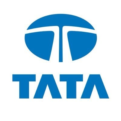
C'mon, this is just a 'T' isn't it?
Yes and No.
The Tata logo is one that hasn't changed even once since its inception in 1945. It does look like a plain 'T' but it has a much deeper meaning with its roots in the strong beliefs of the Tata brand. The logo is meant to signify fluidity. The 'T' can be viewed from two perspectives. It can be seen as a fountain of knowledge and/or as a tree of trust under which people can take refuge.
Audi
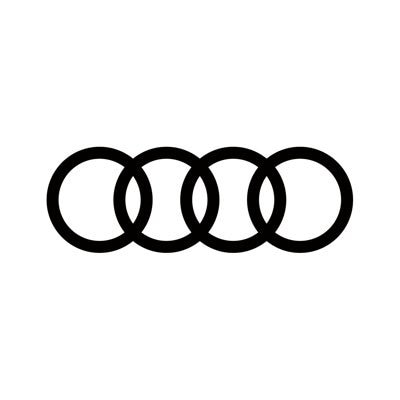
Unlike a lot of other logos, Audi's four rings have a pretty straight-forward meaning. Originally, the company was founded as ‘Auto Union Consortium’ which later came to be known as Audi. The four rings represent the four companies that merged in 1932 to form what we know as Audi today. The companies were Dampf Kraft Wagen (DKW), August Horch & CIE, Wanderer and Audiwerke GMBH.
Volkswagen
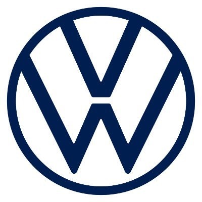
One of the largest automobile manufacturers in the world, Volkswagen too has a very uncomplicated logo. More commonly known as VW, the logo, very simply comprises of those two exact letters. The 'V' stands for 'Volks' which in german means 'people' and the 'W' stands for 'Wagen' which means 'car'. In German, Volkswagen translates to 'People's Car’

Representative image via Unsplash


.")


 on Tuesday, Piyush Goyal emphasised India’s resilience and momentum in navigating global economic challenges.")

")


